Code
import numpy as np
import pandas as pd
import plotly.io as pio
import plotly.graph_objects as go
import plotly.express as px
pio.renderers.default = "plotly_mimetype+notebook_connected"A hands-on introduction to model calibration using Python.
When working with classification problems, machine learning models often produce a probabilistic outcome ranging between 0 to 1. This probabilistic output is then used by people to make decisions. Unfortunately, many machine learning models’ probabilistic outputs cannot be directly interpreted as the probability of an event happening. To achieve this outcome, the model needs to be calibrated.
Formally, a model is said to be perfectly calibrated if, for any probability value p, a prediction of a class with confidence p is correct 100*p percent of the time. In more simple terms, the probabilistic output equals the probability of occurrence.
Let us visualize a perfect calibrated and non-calibrated curve.
import numpy as np
import pandas as pd
import plotly.io as pio
import plotly.graph_objects as go
import plotly.express as px
pio.renderers.default = "plotly_mimetype+notebook_connected"chart_df = pd.DataFrame({
"actual_prob": np.arange(0,1.1, 0.1),
"Calibrated": np.arange(0,1.1, 0.1),
"Non-Calibrated": [min(1,val - np.random.randn()*(1-idx)/20) for idx, val in enumerate(np.arange(0,1.1, 0.1))]
})
fig = px.line(
data_frame = chart_df,
markers = True,
x = "actual_prob",
y = ["Calibrated", "Non-Calibrated"],
template = "plotly_dark")
fig.update_layout(
title = {"text": "Calibrated vs Non-calibrated model", "y": 0.98, "x": 0.5},
xaxis_title="Predicted Probability",
yaxis_title="Actual Probability",
font = dict(size=15),
legend=dict(yanchor="bottom", y=0.95, orientation="h")
)
fig.update_traces(patch={"line": {"dash": "dash"}})
fig.show(renderer="notebook")Fig 1 - A visualization of calibrated and non-calibrated curve.
On the x-axis, we have model output p which is between 0 and 1 and on the y-axis, we have fractions of positive captured within the predicted probability bin. We expect a linear relationship with slope 1.
There are many cases where model calibration is not required like in the case of ranking or selecting the top 20% for some targeting campaign. Calibrated models are especially important in making decision between multiple options of different magnitude or sizes, like expected value problems. In complex machine-learning decision engines, a machine-learning model might be used in conjunction with other machine-learning models.
For example, the business would like to prioritize upselling customer an additional product. So, a data scientist builds two ML models to estimate the probability of a customer buying two different products in addition to the products they are already purchasing.
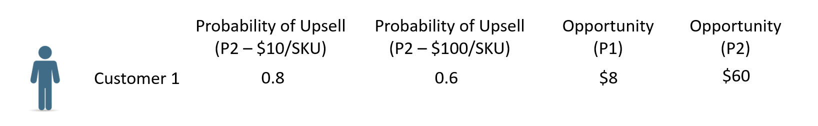
In this case, Product 1 with $10 in revenue has an 80% probability of upselling, while Product 2 with $100 in revenue has a 60% chance of upselling. As a business, you might want to recommend Product 2 to the customer because of the higher expected value.
To do this expected value comparison between models, you need your models to be calibrated to output accurate probabilities.
For demonstration in this article, we will be solving a binary classification problem using the Adult Income Dataset from the UCI machine learning Repository1 to predict if a certain individual income based on various census information (education level, age, gender, occupation, and more) exceeds $50K/year. For this example, we will limit our scope to the United States and the following predictors:
Age: continuous variable, individuals’ ageOccupation: categorical variable, Tech-support, Craft-repair, Other-service, Sales, Exec-managerial, Prof-specialty, Handlers-cleaners, Machine-op-inspct, Adm-clerical, Farming-fishing, Transport-moving, Priv-house-serv, Protective-serv, Armed-Forces.HoursPerWeek: continuous variable, amount of hours spent in a job per weekEducation: categorical variable, Bachelors, Some-college, 11th, HS-grad, Prof-school, Assoc-acdm, Assoc-voc, 9th, 7th-8th, 12th, Masters, 1st-4th, 10th, Doctorate, 5th-6th, Preschool.In the below code we:
## Importing required libraries
from sklearn import datasets
from sklearn.model_selection import train_test_split
from sklearn import metrics
from sklearn.isotonic import IsotonicRegression
from sklearn.preprocessing import LabelEncoder
from sklearn.calibration import CalibratedClassifierCV
from sklearn.ensemble import RandomForestClassifier, GradientBoostingClassifier
import matplotlib.pyplot as plt
%matplotlib inline
plt.style.use('dark_background')

def calibration_data(y_true, y_pred):
    df = pd.DataFrame({'y_true':y_true, 'y_pred_bucket': (y_pred//0.05)*0.05 + 0.025})
    cdf = df.groupby(['y_pred_bucket'], as_index=False).agg({'y_true':["mean","count"]})
    return cdf.y_true.values[:,0][cdf.y_true.values[:,1]>10], cdf.y_pred_bucket.values[cdf.y_true.values[:,1]>10]

def label_encoder(df,columns):
    '''
    Function to label encode
    Required Input -
        - df = Pandas DataFrame
        - columns = List input of all the columns which needs to be label encoded
    Expected Output -
        - df = Pandas DataFrame with lable encoded columns
        - le_dict = Dictionary of all the column and their label encoders
    '''
    le_dict = {}
    for c in columns:
        print("Label encoding column - {0}".format(c))
        lbl = LabelEncoder()
        lbl.fit(list(df[c].values.astype('str')))
        df[c] = lbl.transform(list(df[c].values.astype('str')))
        le_dict[c] = lbl
    return df, le_dict
df = pd.read_csv( "https://archive.ics.uci.edu/ml/machine-learning-databases/adult/adult.data", header=None)
df.columns = [
"Age", "WorkClass", "fnlwgt", "Education", "EducationNum",
"MaritalStatus", "Occupation", "Relationship", "Race", "Gender",
"CapitalGain", "CapitalLoss", "HoursPerWeek", "NativeCountry", "Income"
]
## Filtering for Unites states
df = df.loc[df.NativeCountry == ' United-States',:]
## Only - Taking required columns
df = df.loc[:,["Education", "Age","Occupation", "HoursPerWeek", "Income"]]
df, _ = label_encoder(df, columns = ["Education", "Occupation", "Income"])
X = df.loc[:,["Education","Age", "Occupation", "HoursPerWeek"]]
y = df.Income
seed = 42
X_train, X_test, y_train, y_test = train_test_split(X, y, test_size=0.20, random_state=seed)Label encoding column - Education
Label encoding column - Occupation
Label encoding column - IncomeNext, we:
## Fitting the model on training data
rf_model = RandomForestClassifier(random_state=seed)
rf_model.fit(X_train, y_train)

## getting the output to visualize on test data
prob_true, prob_pred  = calibration_data(y_true = y_test,
y_pred = rf_model.predict_proba(X_test)[:,1])chart_df = pd.DataFrame({
"actuals": prob_true,
"predicted": prob_pred,
"expected": prob_pred
})
fig = px.line(
data_frame = chart_df,
markers = True,
x = "predicted",
y = ["actuals", "expected"],
template = "plotly_dark")
fig.update_layout(
title = {"text": "Calibration Plot: Without calibration", "y": 0.95, "x": 0.5},
xaxis_title="Predicted Probability",
yaxis_title="Actual Probability",
font = dict(size=15)
)
fig.show(renderer='notebook')Fig 3 - An example of non-calibrated classifier
As we can see above, the model is over-predicting in lower deciles and under-predicting in higher deciles.
Isotonic regression is a variation of ordinary least squares regression. Isotonic regression has the added constraints that the predicted values must always be increasing or decreasing, and the predicted values have to lie as close to the observation as possible. Isotonic regression is often used in situations where the relationship between the input and output variables is known to be monotonic, but the exact form of the relationship is not known. In our case, we want a monotonic behavior where the actual probabilities must always be increasing with increasing predicted probability.
Mathematically, we can write the Isotonic regression as following - \[p_{calib} = \operatorname{iso}(f(x)) + \epsilon_i\] Where-
and we want to optimize the following function - \[\operatorname{argmin} \sum(p_{actual}-p_{calib})^2\]
Isotonic regressions is prone to overfitting, hence it works better when there is enough training data available.
We will be using CalibratedClassifierCVto calibrate our classifier. The isotonic method fits a non-parametric isotonic regressor, which outputs a step-wise non-decreasing function. 2
## training model using random forest and isotonic regression for calibration
calibrated_rf = CalibratedClassifierCV(RandomForestClassifier(random_state=seed), method = 'isotonic')
calibrated_rf.fit(X_train, y_train)

## getting the output to visualize on test data
prob_true_calib, prob_pred_calib = calibration_data(y_test, calibrated_rf.predict_proba(X_test)[:,1])chart_df = pd.DataFrame({
"actuals": prob_true_calib,
"predicted": prob_pred_calib,
"expected": prob_pred_calib
})
fig = px.line(
data_frame = chart_df,
markers = True,
x = "predicted",
y = ["actuals", "expected"],
template = "plotly_dark")
fig.update_layout(
title = {"text": "Calibration Plot: Isotonic", "y": 0.95, "x": 0.5},
xaxis_title="Predicted Probability",
yaxis_title="Actual Probability",
font = dict(size=15)
)
fig.show(renderer='notebook')Fig 4 - An example of calibration using Isotonic regression
As we can see above, the model is well calibrated once Isotonic regression is used because the actual probability lies much closer to the expected probability.
The sigmoid method, also known as Platt scaling, works by transforming the outputs of the classifier using a sigmoid function. The calibrated probabilities are obtained using the following sigmoid function - \[p_{calib} = \frac{1}{1+e^{(Af(x) + B)}}\]
Where -
The parameters A and B are estimated using a maximum likelihood method that optimizes on the same training set as that for the original classifier f.
Sigmoid/Platt scaling was originally invented for SVMs and it works well for other methods as well. This method is less prone to overfitting and should be preferred over Isotonic regression if you have less training data.
## training model using random forest and sigmoid method for calibration
calibrated_sigmoid = CalibratedClassifierCV(
     RandomForestClassifier(random_state=seed), method = 'sigmoid')
calibrated_sigmoid.fit(X_train, y_train)

## getting the output to visualize on test data
prob_true_calib, prob_pred_calib = calibration_data(y_test, calibrated_sigmoid.predict_proba(X_test)[:,1])chart_df = pd.DataFrame({
"actuals": prob_true_calib,
"predicted": prob_pred_calib,
"expected": prob_pred_calib
})
fig = px.line(
data_frame = chart_df,
markers = True,
x = "predicted",
y = ["actuals", "expected"],
template = "plotly_dark")
fig.update_layout(
title = {"text": "Calibration Plot : Sigmoid", "y": 0.95, "x": 0.5},
xaxis_title="Predicted Probability",
yaxis_title="Actual Probability",
font = dict(size=15)
)
fig.show(renderer='notebook')Fig 5 - An example of calibration using sigmoid method
As we can see above, the model is more calibrated than our default model but not as well as the isotonic method.
Many boosting based ensembling classifier models like GradientBoostingClassifier, LightGBM, and Xgboost use log_loss as their default loss function. Training with log_loss helps the output probabilities to be calibrated. To explain why log loss helps in calibration, let’s look at binary log loss function -
\[logloss = \frac{-1}{N}\sum_{i=1}^{N}y_i\log{(p(y_i))} + (1-y_i)\log{(1-p(y_i)})\]
Now let’s take an instance of observation where the true outcome is 1. Consider two predictions of 0.7 and 0.9 from the model. If we take the cutoff > 0.5 both of these predictions are correct but the logloss for 0.7 and 0.9 prediction is 0.36 and 0.1 respectively. As we can see log loss penalizes uncertainty in prediction forcing the model to predict close to the actual outcome.
Training with logloss is preferred over fitting a calibration function as model is already calibrated and reduces overhead of training and maintaining an extra model for calibration.
## Fitting the model on training data
gb_model = GradientBoostingClassifier()
gb_model.fit(X_train, y_train)

## getting the output to visualize on test data
prob_true, prob_pred  = calibration_data(y_true = y_test,
y_pred = gb_model.predict_proba(X_test)[:,1])chart_df = pd.DataFrame({
"actuals": prob_true,
"predicted": prob_pred,
"expected": prob_pred
})
fig = px.line(
data_frame = chart_df,
markers = True,
x = "predicted",
y = ["actuals", "expected"],
template = "plotly_dark")
fig.update_layout(
title = {"text": "Calibration Plot: Using boosting method", "y": 0.95, "x": 0.5},
xaxis_title="Predicted Probability",
yaxis_title="Actual Probability",
font = dict(size=15)
)
fig.show(renderer='notebook')Fig 6 - An example of calibration using boosting method
As we can see above, the model seems to be well calibrated. This is usually the case with most of the boosted methods as they use the log_loss function as their default loss function for binary classification.
In this article, we discussed what calibration is, in which applications it is important and why, and three different methods for calibration.
We demonstrated isotonic regression which can be used when there is enough training data available and model is not pre-calibrated.
We also demonstrated the Sigmoid method of calibration which works better when there is not enough training data and model is not pre-calibrated.
And finally, we demonstrated the Logloss metric for calibration which is the default in boosting methods and is our preferred method since the generated model is pre-calibrated and doesn’t require training and maintaining an extra model for calibration.
Dua, D. and Graff, C. (2019). UCI Machine Learning Repository [http://archive.ics.uci.edu/ml]. Irvine, CA: University of California, School of Information and Computer Science. This dataset is licensed under a Creative Commons Attribution 4.0 International (CC BY 4.0) license.↩︎